こんばんわ!
はぁ。
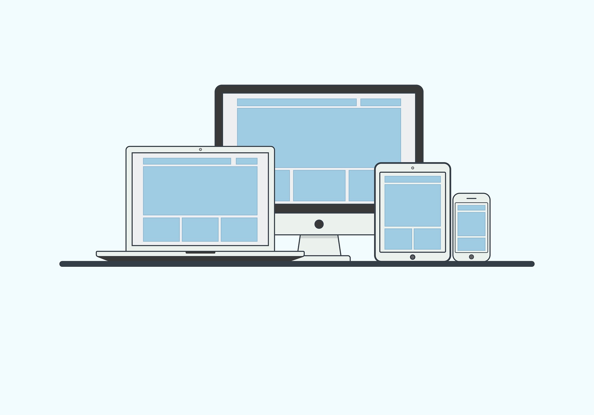
いよいよ、この時を迎えてしまいました!
レスポンシブ!!
出来れば触れずに過ごしたかった。。。
苦手なんですよね。
よし!!笑
今回はテーブルをレスポンシブしたいと思います。
以下、サンプルコード
  <style>
  .top {
    width: 90%;
    padding: 8px;
    margin-top: 24px;
    margin-bottom: 48px;
    margin-left: auto;
    margin-right: auto;
    background-color: #f9f999;
    border-radius: 10px;
  }
  h1 {
    display: inline;
    padding-bottom: 8px;
    border-bottom: 2px dotted #0e6edf;
  }

.rsp {
  border-collapse: collapse;
  width: 100%;
  margin: 20px 0;
}

.rsp th,
.rsp td {
  border: 1px solid #dbe1e8;
  padding: 8px;
}

.rsp th {
  background-color: #f9fafc;
  text-align: left;
  width: 120px;
}
.rsp td {
	background-color: #fff;
	}

@media only screen and (max-width: 480px) {
  .rsp tr,
  .rsp th {
    display: block;
    width:100%;
  }
   .rsp td {
   width:480px;
   }

  .rsp tr:first-child {
    border-top: 1px solid #dbe1e8;
  }

  .rsp th,
  .rsp td {
    border-top: none;
  }
}
  </style>
</head>
<body>
<div class="top">
<h1>レスポンシブテーブルデザイン</h1>
<table class="rsp">
  <tr>
    <th>見出し1</th>
    <td>コンテンツ1</td>
  </tr>
  <tr>
    <th>見出し2</th>
    <td>コンテンツ2<br>test</td>
  </tr>
  <tr>
    <th>見出し3</th>
    <td>コンテンツ3</td>
  </tr>
  <tr>
    <th>見出し4</th>
    <td>コンテンツ4</td>
  </tr>
  <tr>
    <th>見出し5</th>
    <td>コンテンツ5</td>
  </tr>
</table>
</div>
</body>css努力します。。。
では!
レスポンシブ テーブルデザイン